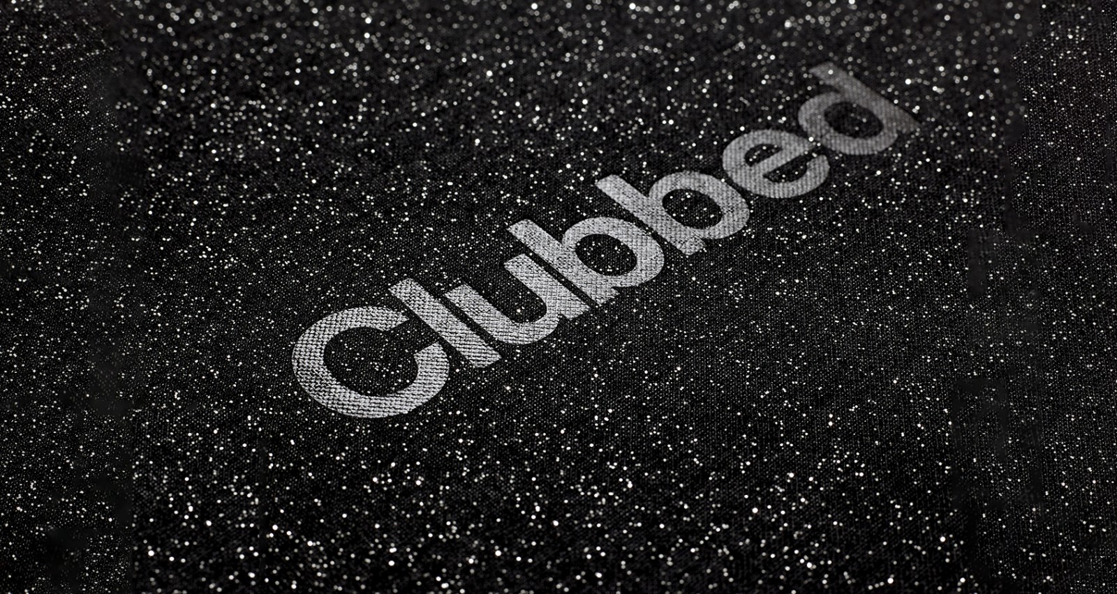
CLUBBED: AN INTERVIEW WITH RICK BANKS
On Wednesday 16 May we held the official book launch of ‘Clubbed: A Visual History of UK Clubbing’, hosted by Floor Talks with Design Manchester. Clubbed celebrates the best graphic design in UK clubs, charting the last 35 years of clubbing history through design from logos, and fonts to posters and flyers – a selection of which were exhibited on the night.
Author and legendary DJ, Bill Brewster soundtracked the exhibition, before publisher, Rick Banks gave an exclusive talk to the audience.
We caught up with Rick Banks in advance to find out a little more about the project.
How and why did Clubbed begin?
I publish books I’m passionate about. My previous two publications were both about football. Dance music, my other passion, was hugely influential to me when I was growing up; it was one of the biggest reasons I got into graphic design. For years, I was always amazed no one had done a modern, visual book on clubbing. Similar types of books were published in the early 90s and they generally featured just flyers with some ‘humourous’ and awful pastiche design.
Where did you draw your inspiration?
As I said above, it was the biggest reason I got into design. In my teenage years, I loved spending hours in record stores, browsing the vinyls and CDs. In addition to hunting down specific tracks I’d heard on the radio or on Napster, I often bought records based solely on the cover art. I didn’t know it at the time but looking back I was infatuated with the details within the design. I would obsess over the logos and try to redraw them in my school books. I’d sit in my bedroom and read all the tiny 5 point copy on the packaging for Gatecrasher CDs or admire the stunning abstract still life photography on a Renaissance flyer. I’d open the inner booklets and read all the footnotes, and memorise who designed what and who produced what. I would study the grid system counting how many columns compilations and club posters showed. I soaked up everything and tried to replicate what I’d seen by making mix-tapes with accompanying — albeit awful — artwork!
At the time, I was still too young to go clubbing but I loved the music and embraced the culture like a true fan boy. I bought CDs, vinyls, posters, merchandise, and collected flyers and magazines. I find it strange that nowadays, this whole experience is often reduced to a tiny square JPEG, often poorly designed, in the bottom corner of Spotify or iTunes. Admittedly I’m not the biggest clubber in the world but I still buy and listen to dance music every day while I work. And I always look out for it’s corresponding design, as they are my two biggest passions. The designs in the book — the very same ones I loved when I was a teenager — formed the designer I am today.
Do you have a favourite club design/logo? If so, who and why?
My personal favourites are Cream and Gatecrasher. I actually wanted to shave the Cream logo into my head as a teenager! Embarrassing looking back. But that’s how strong the logo is. It’s timeless. I liked everything about tDR’s holistic approach for Gatecrasher — the bespoke font, the tiny details, the lairy colours, intricate illustration and distinct tone of voice.
I also loved how fabric abandoned the initial graphic approach (which was common at the time) in favour of a more surreal aesthetic. By using photography, set design and model making their posters have such a unique style to them you instantly know they are from fabric. They have created their own visual world. Sometimes they don’t even use the fabric logo which makes it even more impressive. Sometimes less is more.
Which of the clubs featured in Clubbed would you most liked to have partied at and why?
I would probably say The Haçienda in Manchester. I would have loved to have seen Ben Kelly’s design in the flesh.
If you fancy picking up a copy of Rick’s book, you can buy it here.


